SharePoint Multi-Color Site Themes: How to Apply the New Brand Center Options
Rollout status: The SharePoint Brand Center and extended multi-color theming options are currently rolling out to Microsoft 365 tenants. Availability may vary by region and tenant configuration. Check your Microsoft 365 Message Center for the latest updates.
⚠️ License note: Full Brand Center capabilities (including organization-level font packages and extended brand assets) may require a SharePoint Advanced Management or Microsoft 365 E3/E5 license depending on your tenant configuration. Standard site-level theming is available across most Microsoft 365 plans. Check with your IT admin if features look different than described here.
If you’ve ever tried to match a SharePoint site to your company’s brand colors and ended up staring at a depressingly short list of theme options—good news. Microsoft has significantly leveled up SharePoint’s theming capabilities with the Brand Center, and multi-color site themes are now a real thing.
We’re talking about themes that go beyond “pick one accent color and hope for the best.” You can now define primary, secondary, and even tertiary colors across your site—giving your intranet the kind of polished, on-brand look that used to require a developer and a prayer.
Here’s what it is, how it works, and why your SharePoint sites will never look generic again.
So… What’s the SharePoint Brand Center?
The Brand Center is a centralized hub—itself a SharePoint site—where your organization can manage brand assets at scale. Think of it like a brand style guide that SharePoint actually knows how to read.
From the Brand Center, designated brand managers can create and publish custom color themes, upload organization fonts, and push those assets out across every site in your tenant. No more site-by-site theming. No more “wait, which blue are we using?” chaos.
The big headline feature: multi-color themes. Instead of a single accent color driving the whole look of a site, you can now assign distinct colors to different UI zones—headers, navigation, buttons, backgrounds—all from one cohesive theme package.
Why This Is a Big Deal
- True brand fidelity — You can finally map your brand’s full color palette to SharePoint’s UI, not just pick the closest approximation from a preset list.
- Centralized control — Brand managers publish once; the theme becomes available across the entire tenant. No more emailing hex codes to site owners.
- No code required — The whole thing is done through a UI. Designers and comms folks can manage it without involving IT for every change.
- Consistency at scale — Whether you have 10 SharePoint sites or 1,000, they can all pull from the same brand-approved theme library.
- Site owners still have flexibility — Approved themes appear in the site’s Change the Look panel, so individual site owners can apply them without being able to break outside the guardrails.
How to Set Up and Apply Multi-Color Themes via the Brand Center
Step 1: Access the Brand Center
Your organization’s Brand Center is a specific SharePoint site—typically at a URL like https://[yourtenant].sharepoint.com/sites/BrandCenter.
📌 Admin note: Your IT admin or SharePoint admin needs to provision and configure the Brand Center before it’s accessible. If you don’t see it, ask your SharePoint admin to set it up via the SharePoint admin center under Settings > Brand Center.
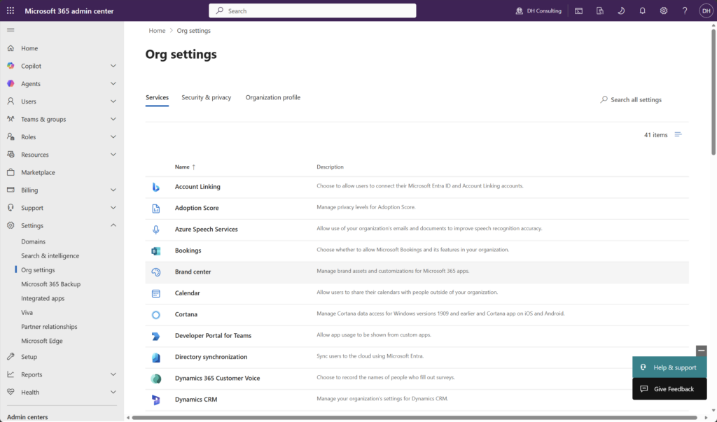
Brand center in SharePoint Admin
Step 2: Open the Theme Designer
Once inside the Brand Center, look for the Themes section in the left-hand navigation or on the Brand Center home page.
- Click + New theme to start a fresh theme, or select an existing one to edit it.
- The Theme Designer panel opens on the right (or as a full-page editor, depending on your tenant version).
[Screenshot: Brand Center home with Themes section highlighted]
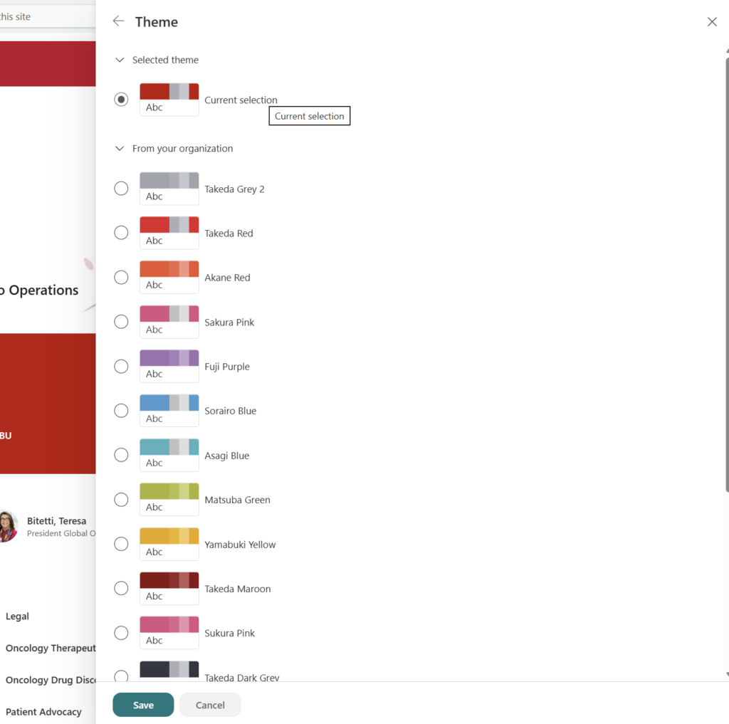
Step 3: Define Your Multi-Color Palette
Here’s where it gets fun. The Theme Designer breaks color assignments into distinct slots—this is the multi-color magic:
- Primary color — Used for key interactive elements (buttons, links, active states).
- Secondary color — Applied to navigation backgrounds, section headers, and certain web parts.
- Tertiary / Neutral color — Backgrounds, cards, and less prominent UI elements.
- Text colors — Light and dark variants for body text and headings on each background.
For each slot, you can:
- Enter a hex code directly (great for brand precision)
- Use the color picker
- Enter RGB or HSL values
SharePoint will automatically generate accessible contrast pairings and warn you if any combination fails WCAG accessibility standards. Don’t ignore those warnings—accessibility matters.
Step 4: Preview the Theme
Before publishing, click Preview to see how your colors render across common SharePoint UI patterns—navigation bars, hero web parts, quick links, cards, and buttons.
Toggle between Light mode and Dark mode previews if your organization uses both.
(Note: The preview is representative. Some third-party web parts may not reflect custom theme colors.)
Step 5: Name and Save the Theme
- Give your theme a clear, recognizable name—something your site owners will understand, like “Contoso Blue – Primary” or “HR Hub Theme.”
- Click Save or Publish.
- Save as draft keeps it in Brand Center for internal review.
- Publish makes it available tenant-wide in every site’s Change the Look panel.
Step 6: Apply the Theme to a Site
Now for the site owner side of things:
- Go to the SharePoint site you want to theme.
- Click the Settings gear (top right) → Change the look.
- Select Theme from the left menu.
- Your organization’s published Brand Center themes will appear alongside Microsoft’s default themes—clearly labeled.
- Click your custom theme → Save.
Boom. Your site now reflects the full multi-color theme your brand team built.
Quick Tips
- Use naming conventions — If you’re publishing multiple themes (department-specific, seasonal, campaign-based), use a consistent naming format so site owners can find the right one fast.
- Test on a communication site first — Communication sites show off theming the most dramatically. Use one as your QA sandbox before rolling out broadly.
- Don’t forget the header layout — Header color is one of the most visible theme elements. Pair it with the right logo version (light vs. dark) in your site’s header settings.
- Bookmark the Theme Designer — If you update brand colors, you only need to update the theme in Brand Center and republish. Sites using that theme will reflect the change automatically.
- Ask about font packages too — The Brand Center also supports custom organization fonts. If your brand uses a non-standard typeface, your admin can upload it there too.
Best Used For
Multi-color Brand Center themes shine when you need:
- Intranet hub sites that represent the full organization and need to feel official and polished
- Department or team sites with distinct sub-brand identities (HR, Marketing, IT) while staying within the corporate palette
- Campaign or project sites with a specific visual identity that needs to feel cohesive
- External-facing SharePoint sites where brand precision is non-negotiable
When to Stick with the Defaults (or Tread Carefully)
- Small teams or informal sites — If it’s a quick project site with a short lifespan, the default themes are perfectly fine. Not every site needs the full treatment.
- Classic SharePoint sites — The Brand Center and multi-color theming apply to modern SharePoint sites only. Classic sites have a separate (and more limited) theming model.
- Sites with heavy third-party web parts — Custom themes don’t always propagate into third-party or SPFx web parts. You may see visual inconsistencies in those areas.
- Rollout timing — If your tenant hasn’t received the Brand Center yet, you won’t see these options. Keep an eye on your Message Center.
Wrapping It Up
SharePoint theming has come a long way. The Brand Center and multi-color themes finally give organizations a real, scalable way to bring brand identity into their intranet—without duct tape, custom code, or a professional designer on speed dial.
The best part? Once your brand manager publishes the themes, site owners across the organization get a simple, guardrail-friendly way to apply them. You get consistency. They get autonomy. Everyone wins.
This week, pick one high-visibility site—your company intranet home or HR hub is a great candidate—and try rebuilding its theme using the Brand Center workflow. Even if you’re just experimenting with what colors are possible, you’ll come away with a much clearer picture of what your SharePoint environment is actually capable of.
Honestly? Seeing your company’s exact brand colors finally render correctly across a SharePoint header is more satisfying than it has any right to be.
📖 Official docs: Customize your SharePoint site with themes and brand fonts – Microsoft Learn