Three New layouts and configurations available for Quick Links web part
Microsoft has recently released some new layouts and configurations for the Quick Links web part. Let’s explore some of the new options available to you and talk about how end-users may want to use them in your organization.
There are now six layout options available.
How to add a web part to the page
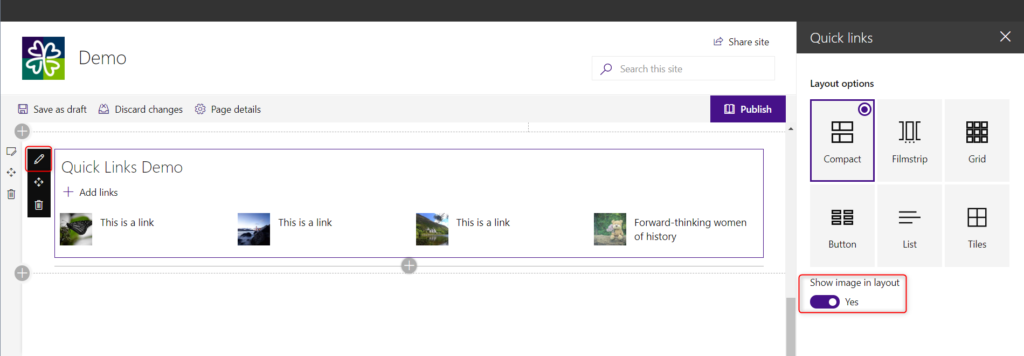
To access the layouts, press the “Edit” button in the top bar to place the page into “Edit Mode”.
Press the “+” in the center of a canvas to open the web part toolbox. Select the “Quick Links” web part and add it to the canvas.
To view the layouts, hover over the web part and select the “pencil icon” from the left side. It will open the web part properties pane on the left side of the screen.
Let’s looks at the options.
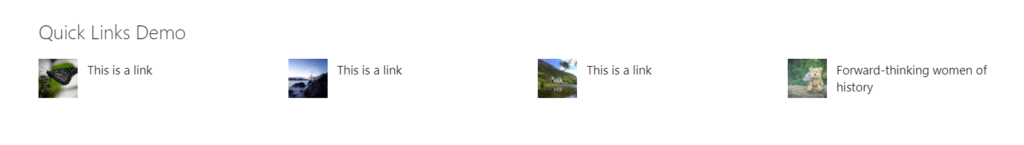
Option One: Compact Layout
Layout Property Options:
- Toggle to show an image or not show an image
Individual Item Edit Options:
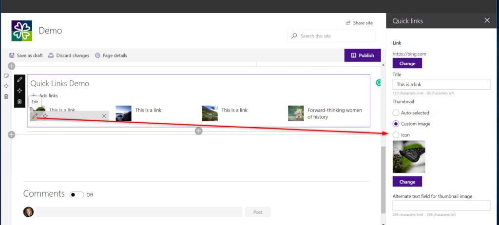
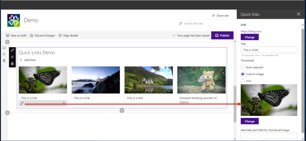
- Change the Link – Allows the user to change the location the link will point to. A user can select from an item within the current site collection, OneDrive, Upload or from a link.
- Change the Title – Limited to 110 characters
- Thumbnail – This is the image or icon if you choose to have one.*The option to edit a thumbnail will shoe even if the user has selected not to show thumbnail images through the layout properties pane.
- Auto-selected:
- A page within SharePoint – the SharePoint icon will show as the image
- A document within SharePoint – the document type icon will show
- Site or link outside of SharePoint – the globe icon will show
- Alternate Text for the image – Add a short description limited to 255 characters describing the image for screen readers
- Custom Image:
- Choose an image from recently used images on the site collection
- Use Web Search powered by Bing to find images located in Creative Commons
- Select an image from your OneDrive
- Upload an image
- Add an image using a URL from another location
- Alternate Text for the image – Add a short description limited to 255 characters describing the image for screen readers
- Icon:
- Select one of the icons that Microsoft is providing
- Auto-selected:
The image will remain 48 x 48px with a grey background if the icon or SharePoint page or document icons are used. If a custom image is used, the image will be cropped to 48 x 48px even if the image chosen is larger
Layout structure:
- Single Column: 4 across
- 2/3 Column: 3 across
- 1/3 Column: 1 across stacked
Does not include:
- Does not show description
- No option to change the background color of an icon
- No option to change icon color
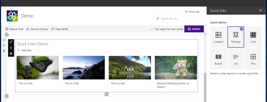
Option Two: Filmstrip
Layout Property Options:
None. Take note that reordering the individual items are not possible in this layout. The user must switch to a different layout to reorder the items.
Individual Item Edit Options:
- Change the Link – Allows the user to change the location the link will point to. A user can select from an item within the current site collection, OneDrive, Upload or from a link.
- Change the Title – Limited to 110 characters
- Thumbnail – This is the image or icon if you choose to have one.
- Auto-selected:
- A page within SharePoint – the SharePoint icon will show as the image
- A document within SharePoint – the document type icon will show
- Site or link outside of SharePoint – the globe icon will show
- Alternate Text for the image – Add a short description limited to 255 characters describing the image for screen readers
- Custom Image:
- Choose an image from recently used images on the site collection
- Use Web Search powered by Bing to find images located in Creative Commons
- Select an image from your OneDrive
- Upload an image
- Add an image using a URL from another location
- Alternate Text for the image – Add a short description limited to 255 characters describing the image for screen readers
- Icon:
- Select one of the icons that Microsoft is providing
- Auto-selected:
User Experience Recommendation
If no image has been selected for the item, there will show a blank white area where the image would be. It is recommended that users have an image for this layout and if none, then have a corporate placeholder generic image that can be used and providing guidance to users on when it should be used.
The Filmstrip layout offers users the ability to have a visually appealing set of items that will provide users the roadmap to click on the arrows and continue the scrolling across. If using this layout within a 1/3 column, the user will only see one item at a time. If multiple items have been added, the user will often not have the time to scroll through every item. It is recommended to limit or be cautious of the items used within this layout.
Layout Structure
- Single Column: 4 across
- 2/3 Column: 3 across
- 1/2 Column: 2 across
- 1/3 Column: 1 item
Does not include:
- Items cannot be reordered in this layout
- No description is shown
- While the item title can be 110 characters, any title name or description that goes past two lines will go to an ellipsis without any way for users to see the additional text.
Option Three: Grid Layout
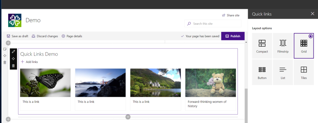
Layout Property Options:
None. Take note that reordering the individual items are not possible in this layout. The user must switch to a different layout to reorder the items.
Individual Item Edit Options:
- Change the Link – Allows the user to change the location the link will point to. A user can select from an item within the current site collection, OneDrive, Upload or from a link.
- Change the Title – Limited to 110 characters
- Thumbnail – This is the image or icon if you choose to have one.
- Auto-selected:
- A page within SharePoint – the SharePoint icon will show as the image
- A document within SharePoint – the document type icon will show
- Site or link outside of SharePoint – the globe icon will show
- Alternate Text for the image – Add a short description limited to 255 characters describing the image for screen readers
- Custom Image:
- Choose an image from recently used images on the site collection
- Use Web Search powered by Bing to find images located in Creative Commons
- Select an image from your OneDrive
- Upload an image
- Add an image using a URL from another location
- Alternate Text for the image – Add a short description limited to 255 characters describing the image for screen readers
- Icon:
- Select one of the icons that Microsoft is providing
- Auto-selected:
Other than the Compact and Filmstrip layouts are only available in SharePoint Online, not available in SP 2019 on-premise. Why does Microsoft continue to do ridiculous things like this and try and pigeon-hole their customers into one solution? They continue to fail in being a customer-centric company.
There are many reasons for this. One of them being that the newer web parts are built using SharePoint Framework. SP2019 does not have all of the same underpinnings that online has, nor can it receive as frequent of updates. A vast majority of companies are using SharePoint online. Is there a reason why you haven’t moved to the cloud yet? I am happy to bring your specific use cases before Microsoft if I understand the context.