If you’ve ever opened SharePoint and thought, “I know what I need is in here somewhere… but where?” — good news. Microsoft has been quietly rebuilding the SharePoint start experience, and the result is something worth paying attention to.
This isn’t just a cosmetic refresh. The new SharePoint start page — anchored by a Discover view — is designed to surface the right content to the right person at the right time, without requiring them to remember which site it lives on or navigate three levels deep to find it.
Here’s what it is, how it works, and why it might finally change how your team actually uses SharePoint.
So… What Is the New SharePoint Start Page?
Think of the old SharePoint home like a filing cabinet. You had to know where things were filed to find them. The new start page is more like a smart inbox — it watches what you and your colleagues are working on and brings relevant content forward automatically.
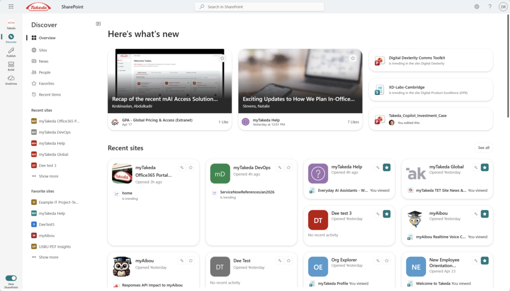
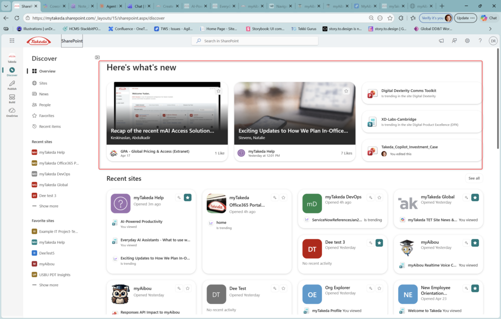
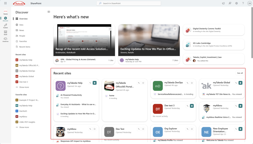
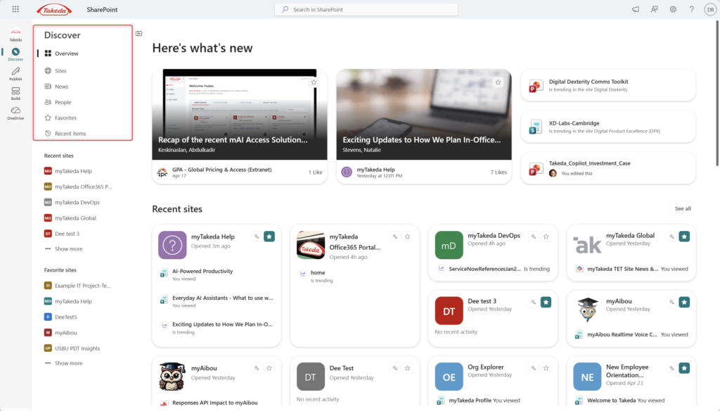
When you land on SharePoint now, you’re greeted by a “Here’s what’s new” section that highlights recent news posts trending across your organization, files your colleagues are actively working on, and content surfaced from sites you frequent. Below that, your Recent sites are displayed as cards — not just a flat list — giving you a quick peek at what’s trending or recently active inside each one.
It’s the difference between “here’s the front door to every site” and “here’s what actually matters to you right now.”
Why This Is a Big Deal
- No more hunting. Content finds you instead of waiting for you to go looking. If a colleague posted something relevant in a site you follow, it shows up — you don’t have to remember to check.
- Trending signals actually mean something. The “Is trending” labels you see on documents and pages aren’t random — they reflect engagement activity across your tenant. It’s a lightweight way to stay aware of what’s getting attention without needing a weekly digest email.
- Recent sites get context, not just links. The new card layout shows you what’s been active inside a site — a recently viewed page, a trending doc — so you can jump directly to the relevant thing, not just the site’s homepage.
- Favorites finally have a home. Pinning sites to Favorites has always existed, but the new layout makes them genuinely useful — a curated shortcut layer on top of the algorithmic discovery below.
- It scales to how your org actually works. Whether you’re in two sites or twenty, the Discover view adapts to your usage patterns. Heavy users with lots of sites get more signal; lighter users get a clean, focused view.
How to Get Around the New Start Page
(Note: steps may vary slightly depending on your tenant configuration or rollout status.)
- Navigate to SharePoint. Open your Microsoft 365 app launcher and click SharePoint, or go directly to your SharePoint home URL (typically
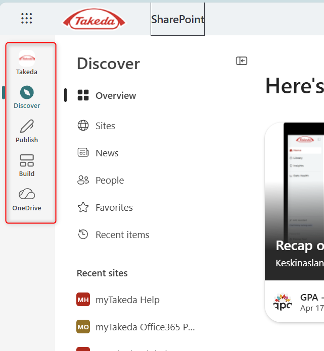
yourtenant.sharepoint.com). - Look for the left-hand navigation panel. You’ll see icons for Discover, Publish, Build, and OneDrive. Click Discover to land on the new start experience.
3. Explore the “Here’s what’s new” section. The top of the page surfaces featured news posts, trending content, and recently edited files from across your organization.
4. Scroll to Recent Sites. Your most recently visited sites appear as cards. Look for the “Is trending” badge on documents inside the card — that’s your signal that something’s got momentum.
5. Pin your most important sites as Favorites. Click the star icon on any site card to add it to your Favorites panel in the left nav. This gives you a stable shortcut layer that doesn’t shift based on recent activity.
- Use the top navigation to switch views. Inside the Discover panel, you can also browse by Sites, News, People, Favorites, and Recent Items — each gives you a filtered lens on the same underlying content.
📌 Admin note: The new start experience relies on Microsoft Search signals and usage analytics. If your tenant has search customizations or content visibility restrictions, some personalization features may behave differently. Your IT admin controls what content can surface across the tenant.
Quick Tips
- The “See all” link in Recent Sites is your escape hatch. If you manage a lot of sites, the card grid only shows a subset. “See all” gives you the full list — still filterable and searchable.
- News cards at the top aren’t random. They reflect engagement (likes, views) across sites you follow or that are broadly active in your org. It’s worth looking at them before dismissing — they’re often more relevant than they appear.
- Don’t over-rely on the algorithmic surface. Pin your critical sites. Discover is great for ambient awareness; pinned Favorites are better for the sites you must check regularly.
- “People” view is underrated. The People section shows your frequent collaborators and their recent activity. If you work closely with a small team, this is a fast way to see what they’ve been up to without hunting across sites.
When to Use It / Best Used For
The new SharePoint start page shines for:
- Cross-functional employees who span multiple teams and sites and need a consolidated view of what’s happening
- Managers and team leads staying aware of team activity without micromanaging
- Onboarding new employees — the Discover view surfaces org-wide news and trending content, giving new starters a sense of what’s happening across the company without needing to know every site by name
- Organizations with active intranets — the more your teams publish news and share documents through SharePoint, the more useful the algorithmic surface becomes
When It’s Not the Right Tool / Things to Watch Out For
If your SharePoint adoption is low, Discover won’t feel magical yet. The new start page is only as good as the content being published. If most of your org is still emailing attachments and barely uses SharePoint, the “Here’s what’s new” section will feel sparse. The page rewards active usage — it’s not a cure for low adoption on its own.
Trending ≠ Important. Something trending across your org might be completely irrelevant to your role. Don’t feel like you need to read everything that surfaces. Treat it like a newspaper front page — glance, decide, move on.
Search is still your friend for specific things. Discover is for ambient awareness. If you need a specific file or page, the SharePoint search bar (or Microsoft Search) remains the fastest path. The start page isn’t trying to replace search — it’s the layer for when you don’t know exactly what you’re looking for yet.
Personalization takes time to feel right. The algorithmic signals that power Discover improve as you use SharePoint more. If you’ve never been a heavy SharePoint user, the first few weeks might feel less personalized. Give it a month.
Wrapping It Up
The new SharePoint start page isn’t a revolution — it’s an evolution that’s been a long time coming. SharePoint has always had the content; what it lacked was a smart front door that made that content discoverable without requiring users to already know where everything lives.
What Microsoft has built here is closer to how people actually work: not always knowing what they need, but knowing it’s somewhere in the organization. The Discover view closes that gap — thoughtfully, and without adding complexity.
Honestly? The best part might be how little it asks of you. No new skills, no new apps. Just open SharePoint, and things start to surface. That’s a rarer thing than it sounds.
Your try-it challenge this week: Open SharePoint’s Discover view and spend five minutes with just the “Here’s what’s new” section. Without clicking anything, notice what it’s surfacing. Then ask yourself: would you have found any of that content on your own today? If the answer is no — that’s the point.