📣 Rollout status: The new SharePoint experience is currently in public preview, available to all Microsoft 365 tenants as of March 3, 2026. A SharePoint Administrator must enable it in the SharePoint Admin Center before users will see any changes. Individual users can opt out during the preview phase if they prefer the current design.
If you’ve spent any time in SharePoint over the last decade, you know the UI has always been… functional. Reliable. But let’s be honest — it never felt like a product that was especially excited about itself.
That changed earlier this year. On March 3, 2026 — SharePoint’s 25th birthday, of all milestones — Microsoft unveiled a genuine visual and structural refresh. Not just a new coat of paint, but a rethink of how the whole navigation experience is organized. And honestly? It’s the most significant change to how SharePoint looks and feels in years.
Here’s what’s new, what it means in practice, and a few things worth watching out for before you flip the switch.
So… What Actually Changed?
The refresh has two flavors: a visual update that applies to the UI chrome, and a structural overhaul of the app bar (that left-hand navigation panel you’ve been living in). They’re related, but worth understanding separately.
The Visual Side: Cleaner, Quieter, More Focused
The new SharePoint applies what Microsoft calls “neutral app theming” — a consistent, softer color palette applied across SharePoint’s UI surfaces. The idea is simple: get the chrome out of the way so your content does the talking.
In practice, this means the UI feels less cluttered. There’s more breathing room, visual noise is reduced, and pages — especially content-heavy ones — feel easier to scan. Microsoft specifically notes that these changes “reduce visual noise, improve readability, and bring clearer structure and visual focus to customer branding and content as users view and edit pages.” If your organization has invested in branded themes and site designs, this is a welcome change — the new chrome steps back and lets your brand step forward.
The command bar also now collapses automatically when someone is in view mode, giving readers a more focused, distraction-free reading experience. Teaching tips guide users to tools that may now be tucked away, so your helpdesk shouldn’t be flooded with “where did the edit button go?” tickets — but it’s worth a heads-up to your team before you enable it.
The App Bar: A New Structure Around How People Actually Work
This is the bigger change for most users. The left-hand app bar — the global navigation that follows you across every SharePoint site — has been completely redesigned around three core scenarios:
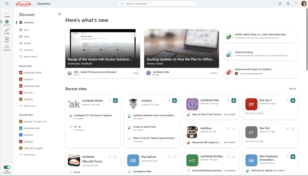
- Discover — replaces the old SharePoint start page. Surface news, recent activity, updates from collaborators, and your frequently visited sites in one personalized feed.
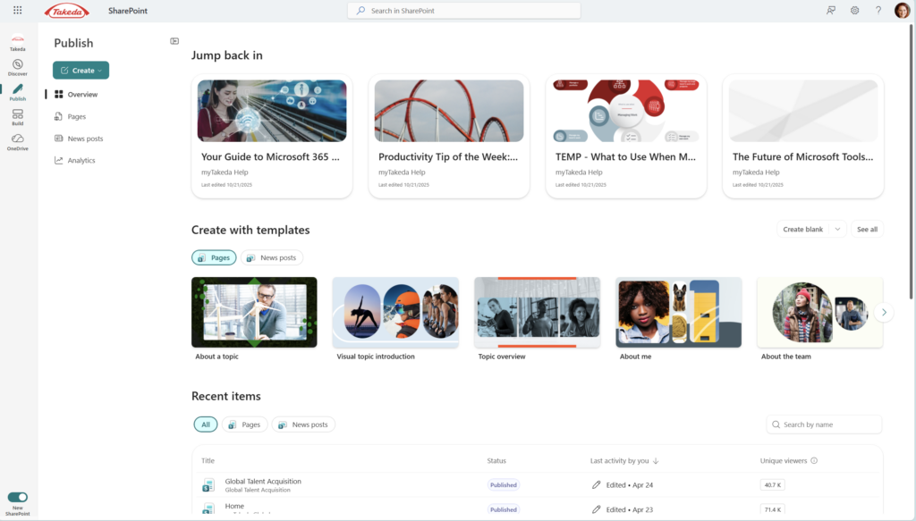
- Publish — for the first time, brings the entire communications workflow into one place. Site authors and communicators can create, manage, and track content across SharePoint, email, Viva Engage, and Teams from a single hub. Notably, this unifies the best of core SharePoint and Viva Amplify capabilities — no license change required for the Amplify publishing model.
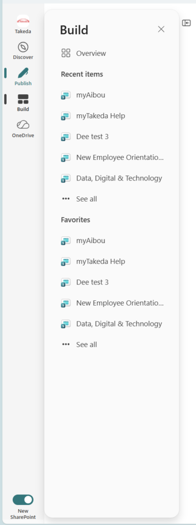
- Build — a new home for creating and managing SharePoint solutions, now supercharged with AI capabilities (more on that below).
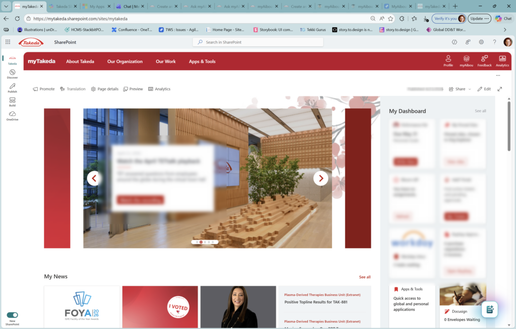
The new app bar also features a collapsible left nav, so you can move between sites, news, people, and saved content without losing your place — or without the nav rail eating up half your screen. If your tenant has a Home site with global navigation configured, that org-wide nav now surfaces right at the top of the app bar with your logo and name. It’s a clean, intentional experience.
Why This Is a Big Deal
- Your brand gets more real estate. With a quieter chrome and neutral theming, custom logos, colors, and imagery in your sites actually stand out instead of competing with Microsoft’s UI.
- Navigation finally reflects how people work. Discover, Publish, and Build are not just labels — they’re honest descriptions of the three things most people come to SharePoint to do. Organizing the product around those jobs makes a real difference.
- Communicators have a proper home. The unified Publish experience is genuinely exciting for anyone who’s ever had to juggle SharePoint news, Viva Amplify, and email campaigns across separate interfaces.
- It’s opt-in — for now. Admins control enablement at the tenant level, and individual users can toggle back during preview. That’s a thoughtful rollout approach, especially for large organizations that need change management runway.
- The foundation matters. Microsoft has been explicit: this new experience is a “foundation for new experiences and innovations as we build out the product’s next chapter.” Enabling it early means your organization is ready for what comes next.
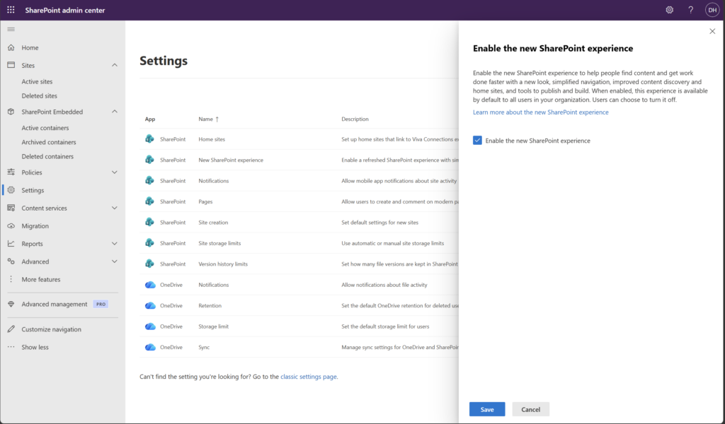
How to Enable the New SharePoint Experience
📌 Admin note: Only SharePoint Administrators or Global Administrators can enable the new experience. Individual users cannot turn it on themselves.
- Go to the SharePoint Admin Center and sign in with admin credentials.
- In the left navigation, select Settings.
- Find New SharePoint Experience in the settings list.
- Check the box in the panel that opens and select Save.
- The new experience will begin rolling out to your tenant shortly after saving.
Once enabled, users will see the redesigned app bar and Discover start page immediately. The toggle to revert to the previous experience is available for individual users during the preview period.
Quick Tips
- Brief your helpdesk before you flip the switch. The collapsing command bar in view mode catches people off guard. A quick “heads up, here’s what changed” email goes a long way.
- Set up your Home site first. Global navigation from your Home site now displays at the top of the new app bar. If you haven’t configured one yet, now is the time — this is where the new experience will shine most for org-wide intranets.
- Use the preview toggle strategically. Let power users and site owners try the new experience first. Gather their feedback before a broad rollout. Having internal champions who can explain the changes is worth more than any announcement email.
- Don’t panic about SPFx. Microsoft has updated SPFx placeholders to align with the new neutral theming. If your organization has custom web parts, test them in the new experience before going wide.
Best Used For
The new experience is especially impactful if you’re running a multi-site intranet with a Home site and global navigation configured — that’s where the new app bar truly delivers. It’s also a great fit for organizations where communications and publishing workflows currently span multiple tools (SharePoint + Viva Amplify + email). The unified Publish experience alone can simplify a lot.
A Few Honest Caveats
AI features require a Copilot license. The new Build experience includes AI-powered site and page creation — genuinely useful stuff. But those capabilities require a Microsoft 365 Copilot license. The Discover and Publish experiences don’t have this requirement, but be clear with your stakeholders about what needs what.
This is still preview. The new experience is public preview as of early March 2026. Microsoft says it will complete rollout over the coming weeks, but “coming weeks” in Microsoft-land can sometimes mean longer. Check your Message Center for your tenant’s specific timing.
Users can opt out — but that won’t last forever. The individual user toggle to revert is a preview-only courtesy. Once the experience reaches general availability, it will become the default. This is good news for long-term consistency, but make sure your rollout plan accounts for it.
It doesn’t automatically improve a messy intranet. A cleaner chrome is wonderful. But if your SharePoint sites are full of orphaned pages, stale news, and navigation links no one has touched since 2019 — the new look will make those problems more visible, not less. Consider doing a content audit alongside your visual refresh rollout.
Wrapping It Up
SharePoint turning 25 could have been just a blog post and a virtual cake. Instead, Microsoft used the milestone to ship something that genuinely changes the day-to-day experience of the platform — a cleaner visual language, a navigation structure that maps to how people actually work, and a real foundation for what comes next.
For intranet owners and SharePoint admins, this is one of those moments where getting ahead of the change pays off. Enable the preview, walk through the new experience yourself, and start thinking about how your Home site and global navigation are set up — because that’s where the new app bar will make the biggest difference.
This week’s challenge: go enable the new SharePoint experience in a test tenant (or use the interactive demo at aka.ms/spat25), spend 15 minutes clicking through Discover, Publish, and Build, and make a list of what you’d want to communicate to your users before you roll it out broadly. That list is your change management plan.
Honestly? After 25 years, it’s kind of exciting to see SharePoint look this good.