Don’t Hit Publish Yet: Using SharePoint’s Accessibility Checker Before Your Page Goes Live
You’ve spent time building a beautiful SharePoint communication page. The banner image looks great, the layout is clean, and the content is solid. You click Publish — and feel good about it.
But somewhere out there, a colleague using a screen reader just landed on your page and hit a wall. The image has no alt text. The heading order jumps from H2 to H4. The link text says “click here.” Three times.
Good news: SharePoint has a built-in Accessibility Checker, and it can catch most of these issues before you ever go live. It’s one of those features that’s easy to overlook — but once you know it’s there, you’ll use it every time.
Here’s what it is, how it works, and why it should be part of your publishing checklist.
So… What Is the SharePoint Accessibility Checker?
Think of it like the spell checker for your page — except instead of catching typos, it catches things that make your content difficult or impossible for people with disabilities to use.
The Accessibility Checker in SharePoint modern pages scans your content for common issues: missing alt text on images, poor color contrast, problematic heading structures, links that lack descriptive text, and more. It surfaces these as errors or warnings, explains why they matter, and (in many cases) lets you fix them without leaving the page.
It’s not a magic wand — it won’t catch everything, and human judgment still matters. But it will catch the obvious, fixable stuff that tends to slip through when you’re focused on layout and content.
Why This Matters (More Than You Might Think)
- Accessibility is a legal and organizational requirement — Many organizations are subject to WCAG 2.1 compliance requirements, either by policy or by law (especially in the public sector). Publishing inaccessible content isn’t just a UX issue; it can be a liability.
- Screen readers are more common than you’d guess — Around 1 in 5 people have some form of disability. Assistive technology users are often invisible to content authors — you just don’t know who they are until something breaks for them.
- It’s always easier to fix before publishing — Retrofitting accessibility after a page is live and linked everywhere is painful. Fixing it in draft takes minutes.
- It improves content for everyone — Descriptive link text, clear headings, and logical structure aren’t just good for screen readers. They make your page easier to scan, navigate, and understand for all readers.
- It’s already built in — there’s nothing to install — Unlike some accessibility tools that require third-party plugins or governance overhead, this one is right there in the SharePoint page editor.
How to Run the Accessibility Checker on a SharePoint Page
(Note: Steps apply to modern SharePoint pages. Classic SharePoint pages do not have this feature. Steps may vary slightly depending on your tenant configuration.)
- Open your SharePoint page in edit mode.
- Navigate to the page and click Edit in the top-right corner.
- Open the page details or toolbar options.
- In the command bar at the top of the page, look for the Check accessibility option.
- Depending on your SharePoint version, this may appear under the ellipsis (…) menu in the top toolbar.
3. Run the check.
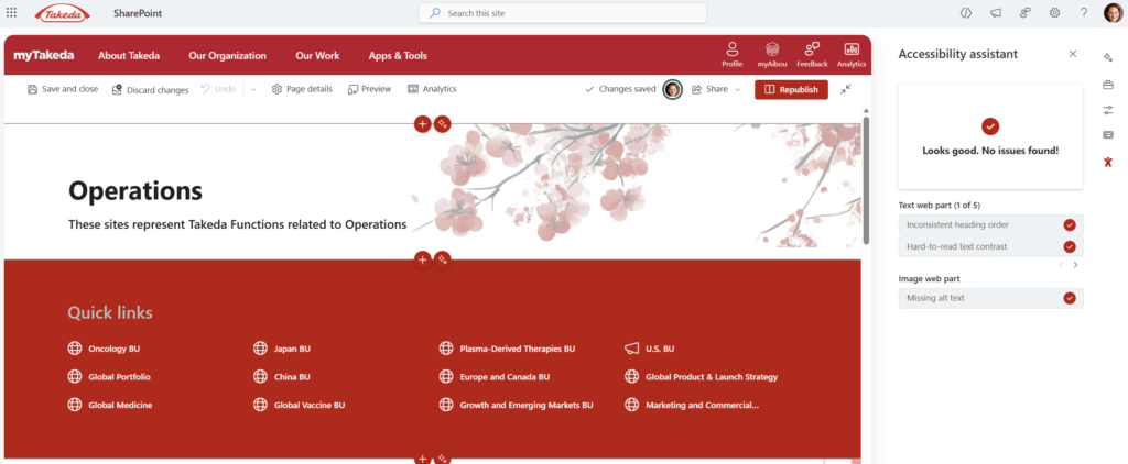
- Click Check accessibility. A panel will slide in from the right side of the screen.
4. Review the results.
- The panel organizes findings into Errors (must fix), Warnings (should fix), and Tips (nice to fix).
- Click on any item to see what’s flagged and where on the page it lives.
5. Fix issues directly.
- For many items — like missing alt text on images — clicking the result will highlight the element on the page and let you fix it inline.
- For more complex issues (like heading hierarchy), you may need to click into the relevant web part and adjust manually.
6. Re-run the check after fixing.
- The panel doesn’t auto-refresh. After making changes, re-run the checker to confirm issues are resolved.
7. Publish when you’re satisfied.
- You don’t need a perfect score to publish (some warnings are judgment calls), but errors should be addressed before going live.
Quick Tips
- Alt text isn’t just a description — it’s context. Don’t write “image of people in a meeting.” Write “HR team celebrating the launch of the new onboarding programme, 2024.” Give it meaning.
- “Click here” is the enemy. Screen readers often pull a list of all links on a page. Imagine hearing “click here, click here, click here” — useless. Use descriptive link text like “Download the 2024 benefits guide.”
- Heading hierarchy matters more than you think. If your page goes H1 → H3 → H2 → H4, screen reader users navigating by headings will have a confusing experience. Keep it logical and sequential.
- Color contrast warnings are worth taking seriously. If the checker flags contrast, there’s a good chance your text is difficult to read for people with low vision or colour blindness — not just screen reader users.
- Run the checker as a final habit, not an afterthought. Build it into your page publishing checklist the same way you’d proofread before sending an email.
When to Use It / Best Used For
- Any communication site page or news post intended for a broad internal audience
- HR, IT, and policy pages where all employees — regardless of ability — need equal access to the information
- Hub site landing pages that are highly trafficked and represent the organization publicly
- Onboarding or training content where clarity and navigability directly affect comprehension
Honest Limitations — What the Checker Won’t Catch
Here’s where I’ll be real with you: the built-in Accessibility Checker is a great first pass, not a full audit.
It won’t catch:
- Complex tables with confusing header associations — it may not flag these even if a screen reader would struggle with them.
- Videos without captions — if you’ve embedded a Stream video, the checker won’t tell you whether it has accurate captions. You have to check that separately.
- PDFs and documents linked from the page — those are separate files with their own accessibility requirements. The checker only looks at the SharePoint page itself.
- Cognitive accessibility issues — plain language, reading level, and content clarity are beyond what an automated tool can assess.
For high-stakes pages — think all-staff communications, compliance content, or anything shared externally — complement the checker with a manual review. Run it through a screen reader yourself, or ask someone who uses one. The checker is a great safety net, but it’s not a substitute for genuine inclusive design.
Wrapping It Up
Accessibility often feels like one of those things teams will “get to eventually” — but the Accessibility Checker makes it genuinely easy to address the basics right now, right in the editor, before anyone ever sees your page.
It won’t turn a thoughtlessly built page into a fully accessible one. But it will catch the stuff that slips through when you’re focused on layout and content — the missing alt text, the broken heading structure, the vague links — and it’ll do it in about two minutes.
This week, open one of your drafted or recently published pages and run the checker on it. Pick something you’ve published in the last few months. I’d be willing to bet it flags at least one thing. Fix it. Republish. That’s it — you just made your intranet a little better for someone.
Honestly? Once you start checking, you won’t be able to stop noticing things. In a good way.